Carlos Alcaraz Branding
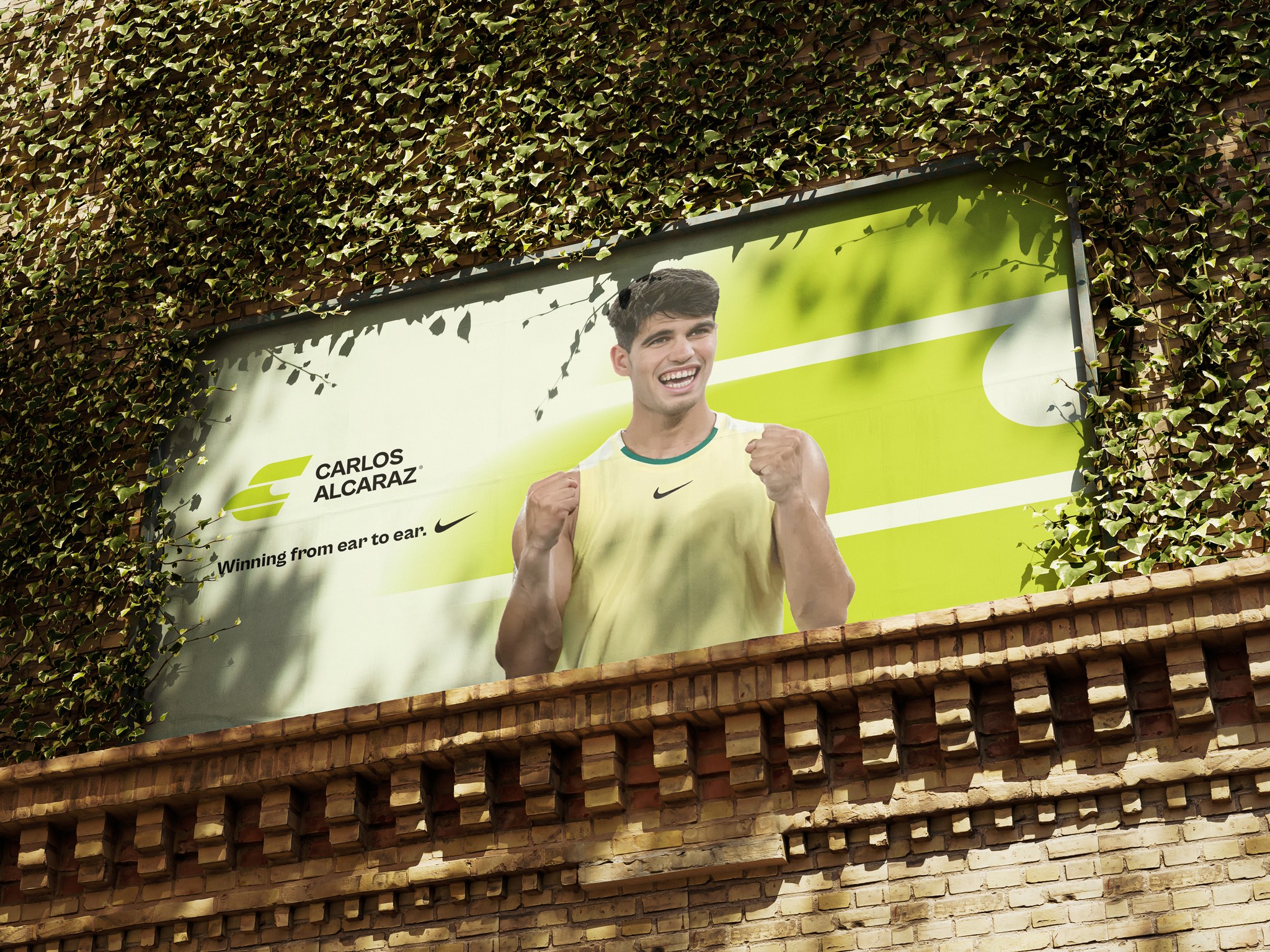
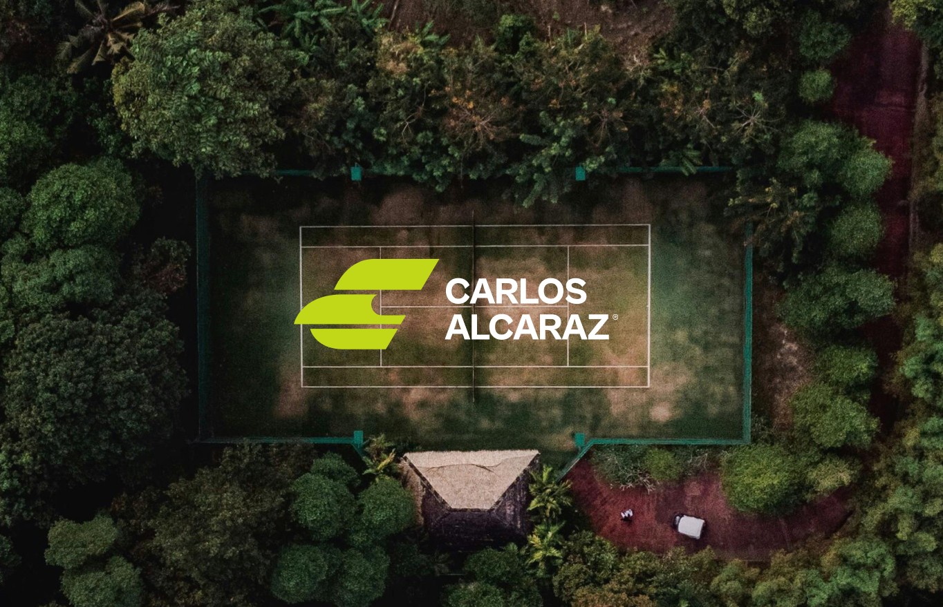
This Branding reflects Alcaraz's dynamic energy and his connection to the different courts such as clay, hard and grass.
The logo shape is featuring bold, rounded edges which symbolizes movement and power, capturing the essence of his play style, evoking a sense of vibrancy and intensity.
The complementary color palette adds to the brand's identity: the earthy clay color brings a grounded feel, while the bright turquoise and light cream add contrast and versatility across various brand applications.
Together, these elements create a strong, cohesive brand that resonates with Alcaraz's presence on and off the court.
Branding Case Study
Role:
Designer
Date:
2024


